Illustration Friday - Dream - Part 3 - Nightmare
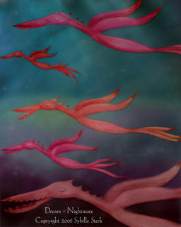
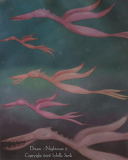
The final part of my triptych was going to be the nightmare. Nightmares are one of those dreams we often do remember and I wanted to use the elements of the original image and create a nightmare - the same way it often happens in dreams, when seemingly harmless objects turn into monsters and the pretty dream turns nasty and dangerous. Again, I used the same background, but this time I changed the colours and made them much darker; I also added another layer on top with weird lighting. Finally, I modfied the birds; they still resemble the floating shapes from the first two pictures but now they have teeth and spikes.
This was the first version of the picture:

Then, I played around with it in Photoshop. I still can't quite decide which version I like better. The second one seems spookier to me, but I like the darker more saturated effect of the first one, too. What do you think? Let me know.

This was the first version of the picture:

Then, I played around with it in Photoshop. I still can't quite decide which version I like better. The second one seems spookier to me, but I like the darker more saturated effect of the first one, too. What do you think? Let me know.


2 Comments:
I much prefer the first one - I feel like it has way more depth. Though, (maybe I am strange) but I thought both images were very serene, rather than nightmarish.
but if I wait ... just a a few seconds longer ... I can see the birds opening their eyes and looking round at me and becoming fierce, ready to attack - okay, so that's a nightmare!
You have a great style - the piece looks like a page from a children's book filled with exciting adventure.
wow great illustaration!
and nice step'n step!!
Post a Comment
<< Home